Home Construction and the Need for Strategic Colour Selection

Delivery Address

Place Order Via Call

Earth-logo English

Home Construction and the Need for Strategic Colour Selection

In the intricate world of architectural design, colour serves as a potent tool harnessed by professionals to sculpt spaces that resonate with functionality, beauty, and human experience. As architects and construction professionals embark on the journey of crafting built environments, the strategic use of colour emerges as a cornerstone of their creative process. From optimising spatial perception to fostering emotional resonance, each chromatic decision is imbued with the potential to shape the way we inhabit and interact with our surroundings.

In this blog, we delve into the nuanced art of colour manipulation. Through a curated exploration of techniques and insights, we will learn about the transformative power of colour in design endeavours. By understanding the principles of colour psychology and its impact on spatial perception, professionals can unlock new dimensions of creativity and innovation, elevating their practice to new heights of excellence.

1. Expanding Perception in Confined Spaces

When confronted with spatial constraints, such as limited square footage, architects can employ a palette of lighter shades like off-white, beige, or cream. Consistency in colour application across walls and ceilings, complemented by a harmonious flooring tone, imparts an illusion of elongation, fostering a sense of spaciousness within confined areas.

2. Cultivating Coziness in Intimate Settings

In spaces intended for intimacy and comfort, such as children's play areas or bedrooms, a judicious selection of deeper hues for walls and ceilings fosters a cocooning ambiance. This strategic use of colour engenders a sense of enclosure, effectively diminishing perceived space and fostering a snug atmosphere conducive to relaxation and solace.


3. Accentuating Length with Horizontal Emphasis

To amplify the perception of length within a room, the integration of horizontal design elements through tonal differentiations proves instrumental. By juxtaposing a lighter ceiling hue with deeper wall tones, architects can visually elongate rectangular spaces, thereby imbuing them with a heightened sense of expansiveness and grandeur.

4. Mitigating Overwhelming Length in Spacious Areas

In instances where excessive length threatens spatial harmony, a nuanced approach involving contrasting colour gradients can restore balance. By adorning the central wall with deeper shades and flanking walls with lighter hues, architects can mitigate perceived length, fostering a more cohesive ambiance suited for communal areas like dining spaces or lounges.

5. Crafting Elegance in Low-Ceiling Environments

In scenarios necessitating the cultivation of a low-ceiling aesthetic, strategic colour application assumes paramount importance. By intertwining lighter wall tones with a deeper ceiling hue, professionals can visually compress vertical space, imbuing rooms with an aura of intimacy and sophistication while preserving spatial integrity.

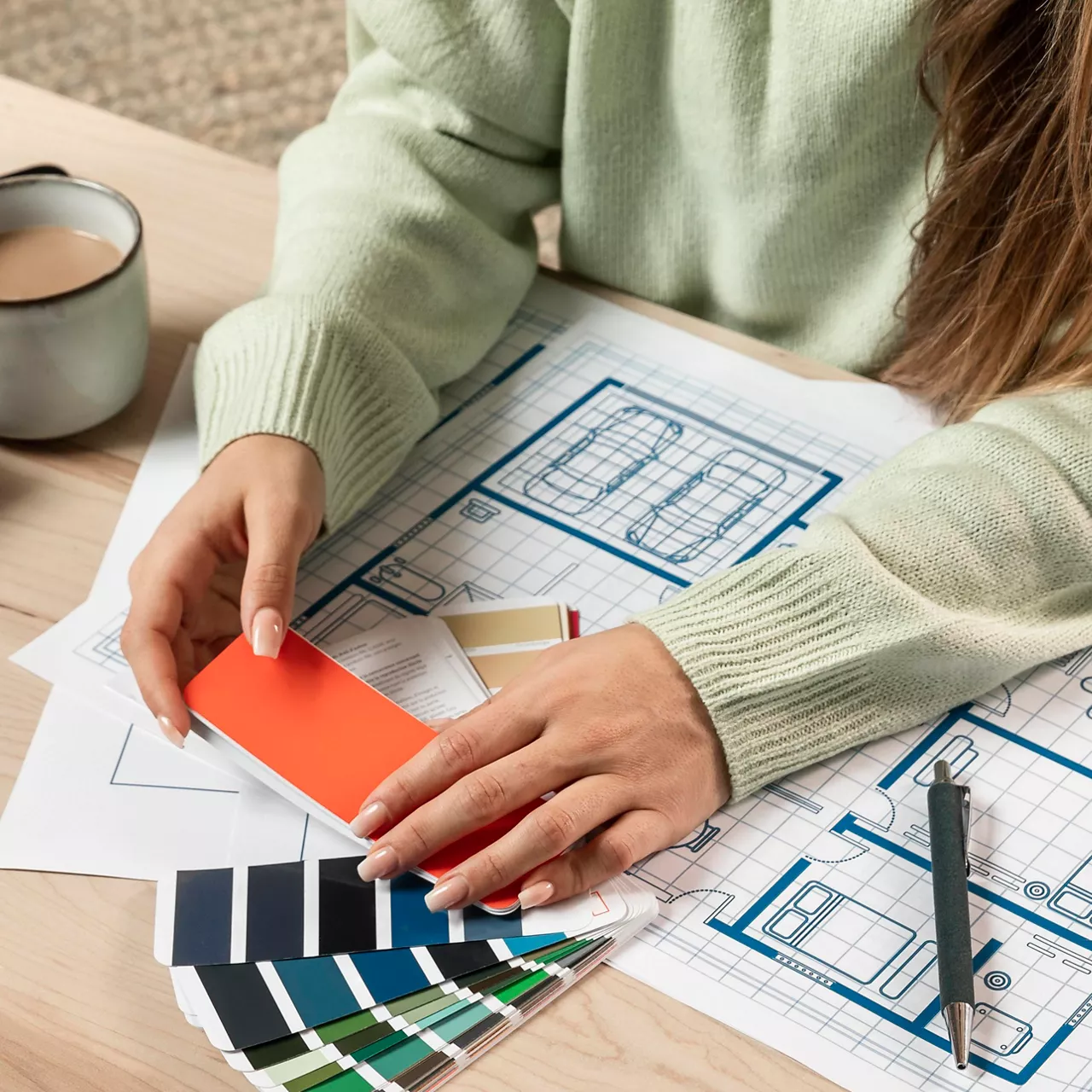
6. Elevating Perception in Heightened Spaces

Conversely, in contexts where vertical expansion is desired, a reversal of colour dynamics proves efficacious. By opting for deeper wall hues complemented by a lighter ceiling tone, architects can create an illusion of heightened verticality, endowing rooms with an air of spaciousness and refinement conducive to elevated living experiences.

7. Redefining Dimensions in Narrow Settings

To navigate the challenge of narrow spaces, a strategic interplay of light and dark tones becomes imperative. By enveloping side walls in darker hues and reserving lighter shades for central surfaces, architects can visually narrow spatial perception, imbuing rooms with a sense of intimacy and focus conducive to streamlined functionality.

8. Extending Visual Continuity in Constrained Corridors

In corridors or elongated spaces necessitating visual elongation, a judicious juxtaposition of colour gradients can work wonders. By adorning central walls and ceilings with deeper hues while opting for lighter side wall treatments, architects can create an illusion of seamless extension, fostering a sense of unbroken continuity and spatial fluidity.

In conclusion, the artful manipulation of colour represents a pivotal aspect of architectural design, offering a means to transform spaces and enhance the human experience. By delving into the intricacies of colour psychology and its impact on spatial perception, professionals are empowered to craft environments that transcend physical constraints and evoke emotional resonance.

Through a curated exploration of techniques and insights, professionals can uncover the transformative power of colour in shaping spatial dynamics. From expanding perceptions in confined spaces to redefining dimensions in narrow settings, each strategy offers a pathway to elevate design excellence and create spaces that inspire, comfort, and delight.

Subscribe and stay updated!

Get all the updates on our latest articles and client stories. Subscribe now!